 ART DIRECTION & LP DESIGN


I provided the art direction and design for Joris Voorn’s LP, featuring his remix of ‘Solid Session.’ The artwork was based on the simple design of the original LP, but with a contemporary twist. By maintaining the minimalist character of the original, the updated design stands out strongly. New images and fonts were used to enhance and modernize the original design. By adjusting the style of the artwork, a new entity is created that is both recognizable and new. The end result is an attractive and modern design with a nod to the past.
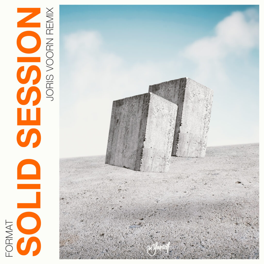
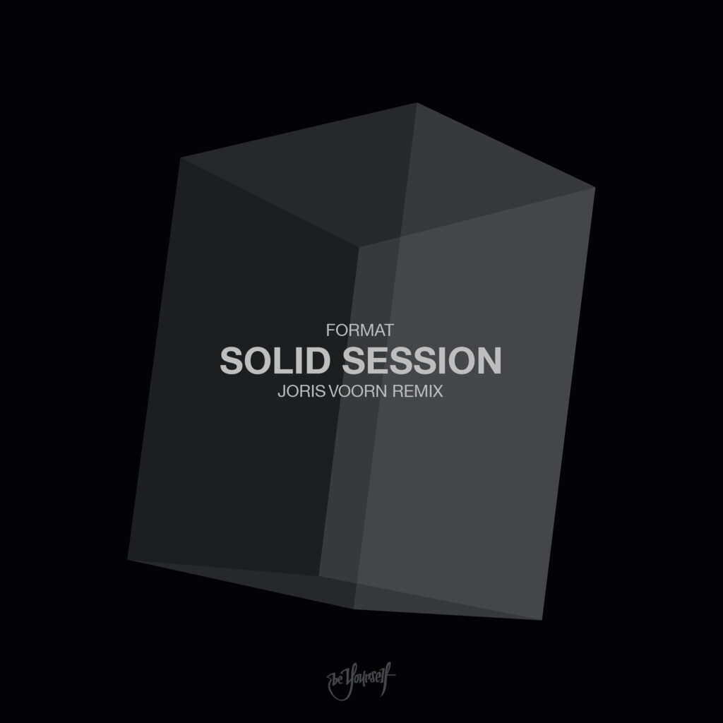
Joris Voorn and his team wanted the artwork to resemble the original design from 1991. Initially, you can see two concept designs that emphasize two solid blocks, which represent the Solid Sessions. However, Joris Voorn’s team deemed this artwork too dissimilar from the original, which was characterized by simplicity and darkness. With the feedback gathered from the initial designs, I created the final artwork.
 first concepts


 final artwork


Above you see the final product. Taking inspiration from my initial concepts and maintaining the integrity of the dark aesthetic portrayed in the original track’s artwork. I came up with this final design.
After a few iterations and revisions, we achieved a design that captured the perfect balance between creativity and cohesion.
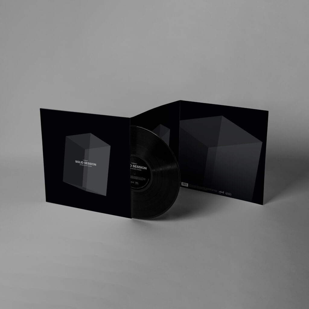
After reaching a final design for the cover, I implemented the design into the physical vinyl record. The process was both challenging and rewarding, but in the end, the final design was more than worth the effort required to create it.